ShopDreamUp AI ArtDreamUp

Deviation Actions


Description
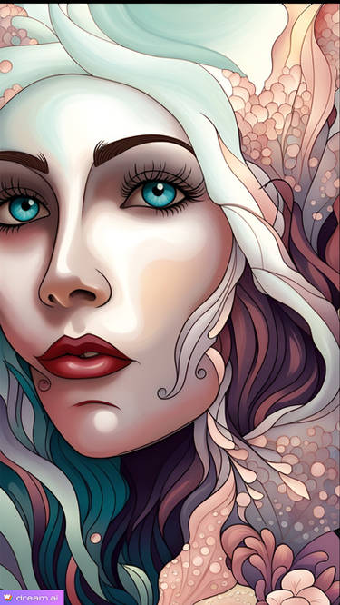
Serenity - Just as the name conveys. She is peaceful, serene, tranquil and calm as butterflies take flight around her.
This is the newest and first in a series of fairy portraits.
Created from my original digital painting.
This is the newest and first in a series of fairy portraits.
Created from my original digital painting.
Image size
2400x3000px 4.83 MB
© 2012 - 2024 concettasdesigns
Comments6
Join the community to add your comment. Already a deviant? Log In
Pros: This has a beautiful composition. Everything just flows nicely together and it just keeps dragging you into the portrait. You did a very good job at illustrating the word Serenity; the character's expression, body language, the butterflies, even the colors have a nice soft feeling to it. I also love how some strands of hair are dangling off the portrait frame; it just as if it oozes with creativity.
Cons: As much as this piece is gorgeous there are things that I feel ruin it. Firstly, I see that you have drawn individual hair strands and that gives off such a realistic feeling to it, regardless of it's cartoony twist. But when you go to the chunks of hair, you can see those little strands but they look flat. Some hairs overlap each other that doesn't really follow the path the hair strands are following (but there are in a couple of places). I feel the face is too squished in. The eye is too close to the nose bridge and it also looks like, because of that strand next to the eyelash, that the eye is sitting on top of it. Also, even though the hair is covering it because you didn't give more information it looks like her other eye doesn't exist. She has a button nose, but that odd lineart above the nostril throws me off a little. While the lip is fine, I think it too close to the chin and it looks like to me she has an extreme overbite (which I don't think that's what you were going for). While the skin goes nicely with the overall color skin... the pink it just... doesn't go well with it. The shadows also look a little weird because in some areas you have this yellowish brown and then you have in other places the pink substitues as a shade.
Suggestions: What I think might help you with the skin color is maybe add a little more orange if you want to keep that pinkish color. I just feel like there is this missing gap between the yellow and the pink colors. I think also your shadow colors might be too saturated and I think you should add a darker brown to it. Also, you could get rid of the pink and maybe substitute it with a little peach color? Although, that might weaken the color of the lips and the eye. Although I'll have to say in some places I think you need a little casting shadow, just a little bit (such as the hair's shadow casting on the cheek). Another is just moving the individual face parts around (moving the mouth upwards from the chin and move the eye a little bit away from the nose bridge). You can get rid of that line above the nostril since you didn't present the lineart for the nosebridge. I think you can replace by using shading (but it should not be very dark). Make sure that the eyelash is at least covered by the hair or that there is shadow covering the eye so that it doesn't look like the eye is above the hair. Also, you should draw some information that she has another eye because as it looks like right now she's a cyclops. And with the hair, bold out the strands of hair but also change the lineart a little bit. Don't make it look so flat. Make it more curvy like strands are popping out of the individual clunks of hair. Not so much, but just so it gives it more life.
FInal Thoughts: I love when people illustrate a word and accomplish it so well. I hope you're doing a theme project and are planning more of these word illustrations; I feel you're really good at these. Just make sure that you be careful of how you color skin, make sure you give more information even if it's covered, and your facial proportions and I think you should be fine. Please, keep up the good work!